
Unsurprisingly, given the rise of e-commerce giant Amazon in the last two decades, online book and eBook retail has become a massive growth industry for aspiring entrepreneurs.
Major e-commerce platform, Shopify, has stated that in 2021 the Year-on-Year (YoY) order growth of print and eBooks is up 21.63% globally. Certainly this has attracted many people to look at retailing such products themselves online – primarily through drop shipping straight from publishers, although a more traditional stock and storefront model has been adopted by some.
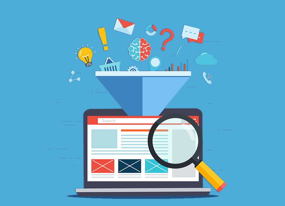
However, as with any competitive market, it’s important that you do everything possible to capture and retain customers through your website and digital marketing efforts. So, in this article, we’re going to look at what you can do to ensure your ecommerce book website is designed for maximum conversions.
How To Stop People Bouncing From The Site
Reducing Page Load Speed. The biggest deciding factor in users mind when they’re deciding whether or not to bounce from a website – is the load speed of the landing page. Regardless of whether your SEO efforts, PPC Campaigns or Social Media have sent a user to a page, typically you’ll have no more than three seconds for the pages to load before they’ll bounce.
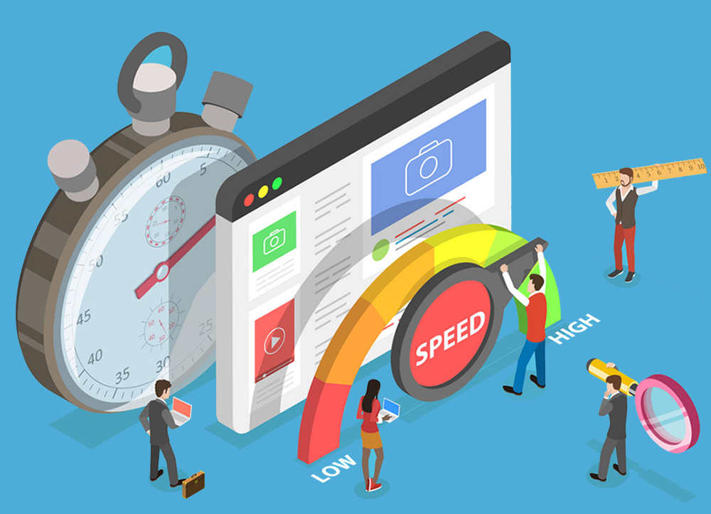
The best place to start with page load speed is to first run the site through a tool like GTMetrix or Google’s PageSpeed Insights. These tools will not only give you an accurate picture of how long load speeds are across your site, but they will detail and prioritise the things that can be done to improve your page speed too.
One of the most common areas to optimise on a website’s design in regard to page speed will largely be to ensure any large content files (i.e. images and videos) are as well optimised and compressed as possible. This means using the smallest file sizes possible and also to consider implementing lazy loading on the site to ensure the First Contentful paint (FCP) is as low as possible.
Fix Usability Issues. UX & Mobile Responsiveness are massive factors affecting the bounce rate of any website. Websites which don’t render correctly, have content that isn’t responsive on mobile, have multiple 404 errors or that have broken links or menus will all have higher bounce rates as a result.
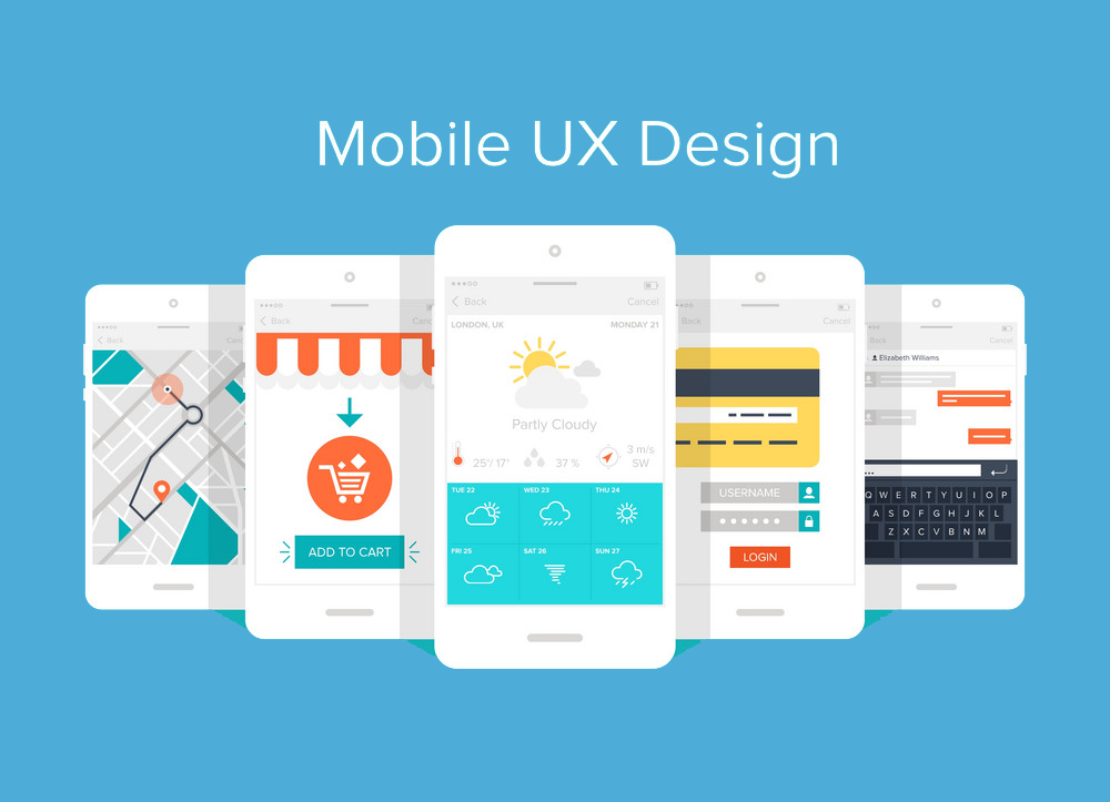
Conducting a UX audit of your own website is the best place to start. Using a range of software (i.e. crawlers such as Screaming Frog will help identify 404s) and by also reviewing your site manually from a user’s perspective will help you identify the fixes needed to keep a website usable and friendly from the point of a customer landing on it.
Ensuring Navigation Throughout The Website Is Seamless
Typically in book and eBook retail, there are going to be a huge range of products offered on the website. Not only this, but on the whole many users will be looking to purchase multiple books at once as opposed to single item purchases. This means that once a user lands on a specific category, product or other page – they’re going to need to be able navigate freely and easily throughout the site, and any frustration to these efforts is likely to persuade them to abandon their session and look elsewhere.
Header Menu. this is going to be the first thing users look for when it comes to easily navigating between key pages. Therefore, not only does it need to be well-presented and easy to read/use but it should also be ‘sticky’. This means it should follow down the page on all devices – otherwise users will quickly become frustrated with having to scroll all the way up and down a page to go back to the menu.
Item Priority. Header menus should then be set up in a way that does not overwhelm the user with a huge space consuming array of options, but that also ensures they can find what they’re looking for. Typically the topmost menu items should be carrying the most important and relevant pages and then under this should be areas such as Category and FAQ pages.
Optimising Category Pages For Usability & Trust
As alluded to earlier in this article, many users on a website retailing books and eBooks will be looking to browse and/or purchase multiple items. Therefore, not only does site navigation need to be well structured – but also category pages should be optimised and designed with features that make it easier for users to browse.
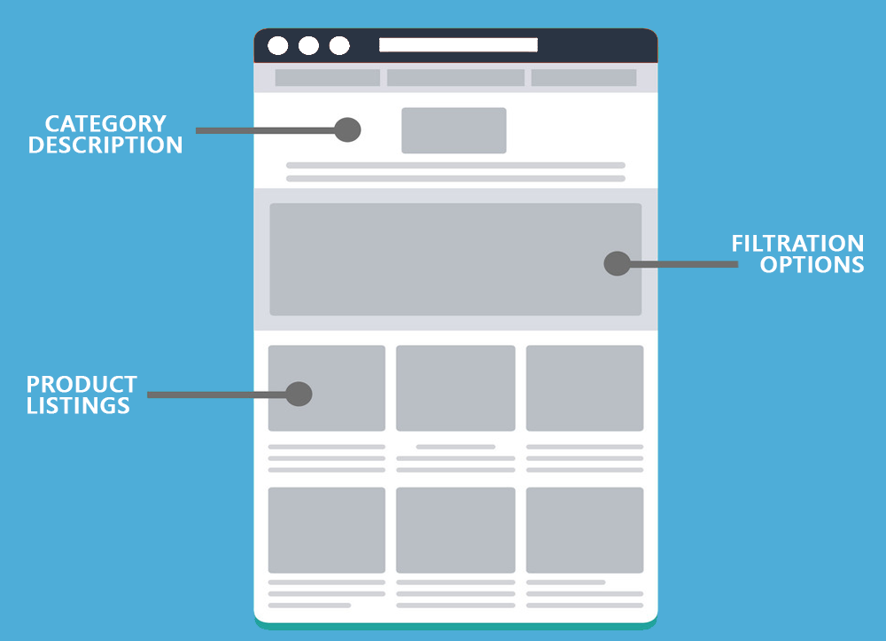
Clear & Attractive Category Descriptions. As a user lands on or navigates to a certain category page, it’s crucial to catch their attention and present value in the content they’re going to see first. Having clear language that details exactly what is included in each category, as well as looking to use persuasive language in the tone of voice will help ensure that they stick around and begin browsing the products listed here.
Filtration. With an array of different product categories in any print or eBook retail – different genres, authors and age categories to name just three, it’s vital that category pages themselves have functional ways of sorting options for users. Product filtration is one of the strongest ways this can be done. Segmenting down the different categories further allows for a much more well-rounded UX overall.
Consistent Product Listings. When listings then appear on category pages, there should be uniformity and consistency in the way they are presented to the user. Having this consistency is one of the strongest trust signals you can have. It demonstrates to the user a higher level of professionalism, portrays luxury and gives the user the impression that all products belong to the business and are not being resold or drop shipped.
Optimising Product Pages For Conversions
Product Descriptions. Ordinarily for an eCommerce store, the recommendation that jumps out is to have well optimised imagery of products. Naturally, this is still true for print and eBooks – although typically shoppers are most likely to be more interested in descriptions, summaries, blurbs and reviews of books before they commit to a purchase.
Similarly to the category page descriptions mentioned above, the use of persuasive and emotive language in the product descriptions is a key way to maximise your Conversion Rate Optimisation (CRO) efforts here. Each product description should be presented in a way which highlights individual USPs (even over other similar products), for example; ‘best-seller’ would be a perfect selling point to draw a user’s attention to.
Strong Call To Action. CTAs are the absolute key to ensuring your individual product pages are set up for conversions. Highlighting and positioning with prominence the ‘buy now’ or ‘order now’ buttons is going to be one of the first things to look at here.
Also then consider offers & discounts that can be displayed on individual products. Yes, a countdown clock with limited stock is almost certainly a bad idea and far too pushy – but offering ‘free delivery on orders over £X’ or something similar is a great subliminal trigger to push people further into converting.
Having An Optimised Sales Journey To Maximise Conversions

As Few Clicks/Stages As Possible. Almost 40% of people will abandon carts in the event that they have to enter information repeatedly or they feel the checkout process is too long. It is therefore vital that store owners look at the best possible ways for keeping the process as short and as user-friendly as possible.
An example of a simple fix here should be to ensure that billing/delivery information does not have to be input more than once and can be linked easily at checkout so a user won’t have to enter this information twice if it is the same.
Essentially, the best way to really make improvements here is to carry out a review of the checkout process from the perspective of a potential customer. Make changes and notes on what can be changed, then (if still unsure) consider A/B testing different checkout models to see which performs best with your audience.
Exit Intent. A key way that ecommerce store owners have looked to reduce their cart abandon rates has been to use exit intent pop-ups successfully. Whilst this can be seen as a more aggressive sales technique, if done correctly it can massively improve the conversion rates of an online store.
The key here is to ensure that the way in which it dissuades a user from leaving is by presenting some form of additional value. This could be a discount code, an offer of free delivery or something else – but it needs to present the person with a strong enough reason for committing during this session.
Are you responsible for an E-Commerce Website, and want to look at how you can really maximise conversions?
Well get in touch with our team today and find out how Assured Marketing can start you on the journey to consistent online sales today!
0 Comments